| Главная » Уроки » Не переведённые уроки |
Create a Syfy Inspired Logo Animation in Photoshop
 You already know that Photoshop is a fantastic tool for creating 2D images. What you might not know is that Photoshop also has limited capabilities for creating high quality 3D images and animations. In this tutorial, we will use the new and improved 3D and Timeline features of Photoshop CS6 to create a Syfy inspired text effect and logo animation without any additional applications. Let’s get started! Step 1 Set up the document OK first of all let’s set up the document we will be working on, don’t get to crazy since we will be rendering 3D in high quality and that takes quite a bit out of your computer so a nice video size will be as shown here. 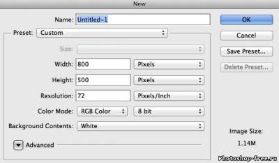 OK let’s now find our bearings since we will do animation, I have been asked several times where is this animation thing. Well if you have Photoshop CS6 in its default installation you will find in the bottom left corner these two tabs, mini-bridge and time line. 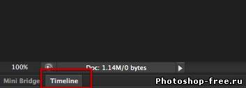 Double click on time line and there you go there is the time line tab of Photoshop, of course there is nothing there because we have not animated anything yet. We will be adding stuff here later and you can think of it as video layers. 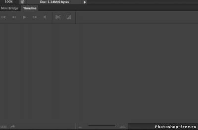 Step 2 Text Layer OK now let’s make the star of the show, the text layer, so pick up the text tool.  Type out the word tuts.  Apply the Blippo font which you can find with a quick search. Once you find it, be sure to get the Blk BT version install it in your system and select it in Photoshop to change the look of the text. 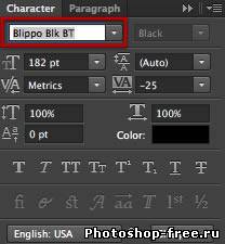 You will get something like this  Now to make our text a 3D layer simply go to the 3D menu on top and select New 3D extrusion from selected layer. 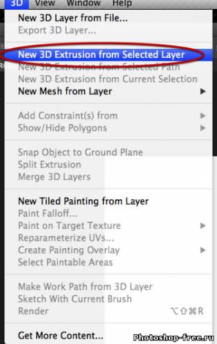 You will get this dialog from Photoshop, and for the rest of the tut serves us well being in the 3D workspace so go ahead and click yes. 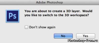 And voile! We are on a 3D space with our text all ready to go. 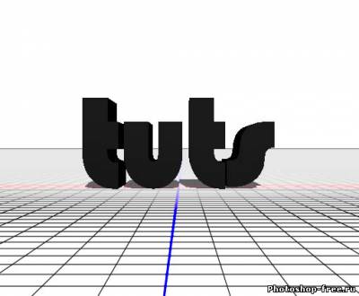 You can see a tab on the right next to the usual layers tab that contains all the 3D elements of a new scene. 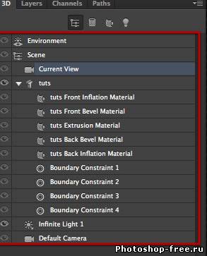 Now the text layer gets transformed into a 3D object which contains several sections for the shape, and each containing a separate material. We will select all the materials as shown here. 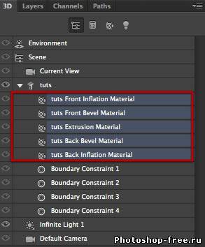 We will go to the properties tab and select this simple flat material, and then click on the diffuse color indicated below. 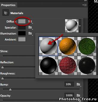 Make the diffuse color white in the familiar color picker that pops up. 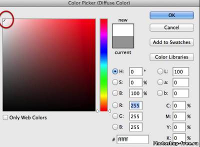 We will also change the ambient color so go ahead and click on it as shown. 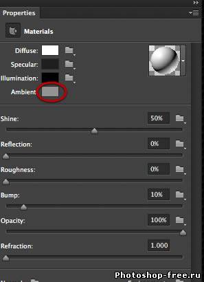 And select a light gray as shown here. 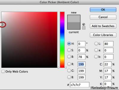 OK now we want the text to lay flat on the ground plane, so we need to rotate and place it at this level. Select the tuts layer/object. 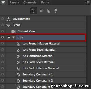 And again go to the properties tab, choose coordinates and rotate the object 90 degrees so it lays flat on its back. 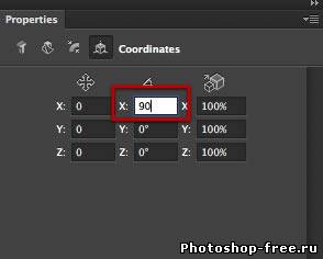 What we will do next is reduce the thickness of the text extrusion, so in the properties select mesh and reduce the depth to 48 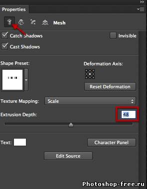 Once we have all these done let’s use this command to bring the object to the ground level. And that is it we have the text ready and in place. 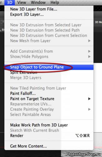 Step 3 Ground plane We have been talking about the ground plane but yet we have no actual object for it, just the reference on the 3D space grid, so let’s make a ground shall we? 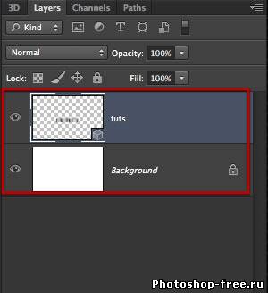 So select the rectangular shape tool, and drag a big rectangle all over the canvas.  Now to introduce this new layer into our 3D world we need to first make it a 3D object, so go again to the 3D menu and select plane from the new mesh from layer sub-menu. 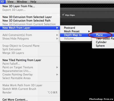 Now when you do this you get a new 3D layer that contains a whole new separate scene, and we don’t want that in this case; so to get our new plane into the same scene as our text we need to first select both layers outside the 3D world. 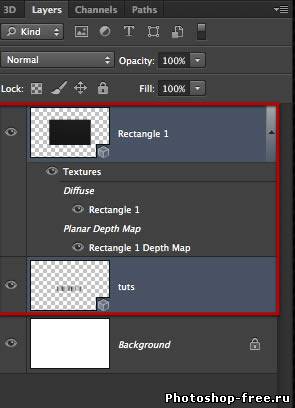 And again simply go to the 3D menu where you can find the merge command. 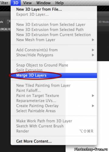 Now if we go back to the 3D tab we can see now we have the text object "tuts" and the new rectangle layer. 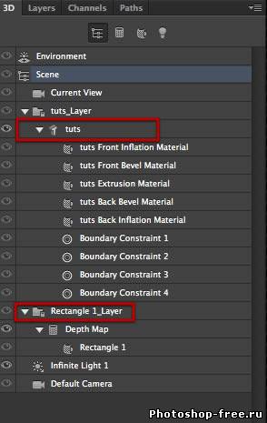 Yet in the layers tab you have only one layer that contains the 3D scene. 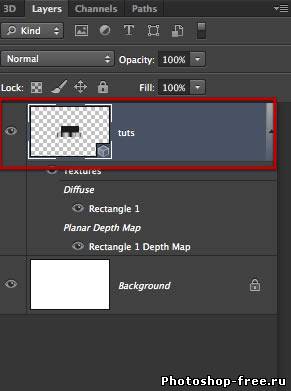 Now we want to see the text from top so we can adjust the coordinates of the current view as shown or drag on the view until you get the top view. 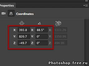 We are looking to get a view from top such as this. 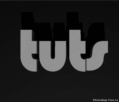 Now once we get this view you can see the ground its dark, or whatever color was choose at the time you created, and we need to replace this with a 3D material, let’s choose one of the text parts. 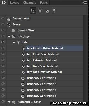 You can see the material we created earlier, and we need to make a new material out of our settings 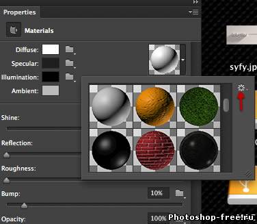 Click on the gear shown above and select new material. 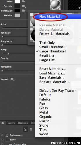 So you will get this dialog, where you can name the material whatever you want, and click OK.  Now let’s go to the material in the rectangle plane layer. 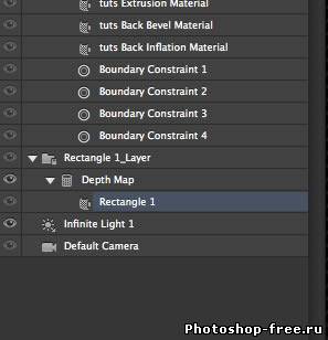 And from the material thumbnails scroll all the way down where you can find the new copy of the material, go ahead and choose it. And that is it we have our white ground and both objects correctly placed. 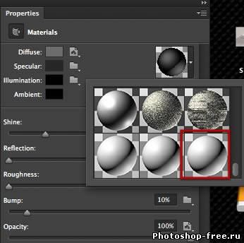 Step 4 Lights OK we are in Photoshop right so for some illumination we will do some adjustment layers and some shading…right? Wrong! We need to setup a 3D scene so to match the light of the original Syfy intro we will need several lights. First of all select the light we already have. 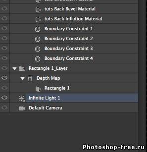 In the preview you will get this kind of controls for the light, for now it showed the light in front of the text with a dark shadow behind, so let’s move the light bay grabbing the small sphere and rotating as shown here. 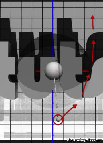 You can also do this in the coordinates, on the properties tab. 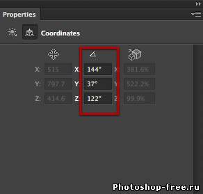 As soon a s you turn you will see feedback on open GL of what the thing is looking like and where does the shadow now go. We want the shadow as shown here to go diagonally from top right to lower left. 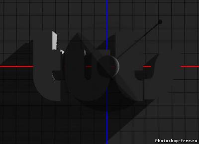 Now let’s create a new one, all the way down on the 3D palette you can find the little icon that usually creates layers, yet in the 3D tab it creates lights. So choose a new infinite light. 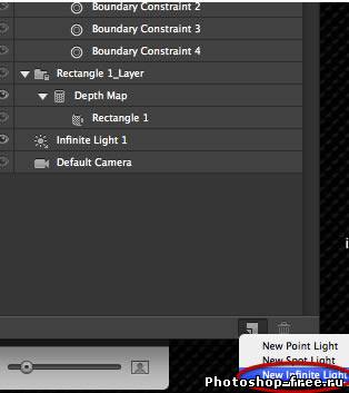 The new light appears directly on top as shown here. 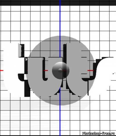 Lets move this light exactly as it shows here. 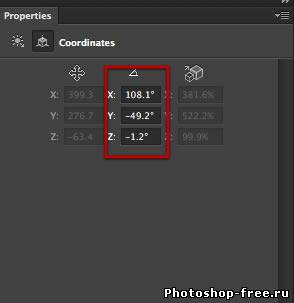 Also adjust the properties of this light as shown below. 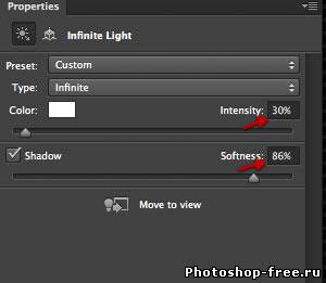 Lets go back to the original light and select it. 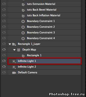 And also adjust the properties as shown here. 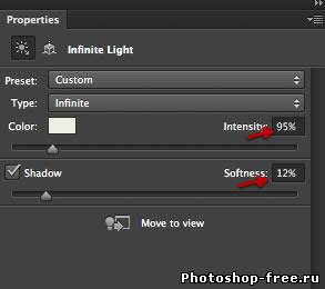 Lets now create two more lights as shown here. 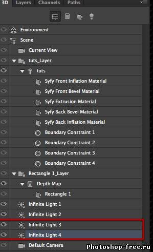 Lest change the color for light 3, just click on the color rectangle shown here. 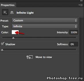 And from the color picker choose a light red such as this. 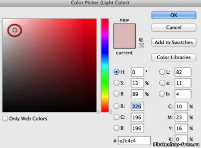 Then adjust the intensity and softness as indicated below. 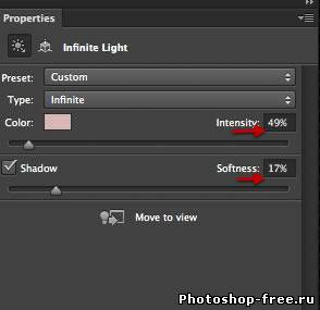 Go to light number 4 and also change the color. 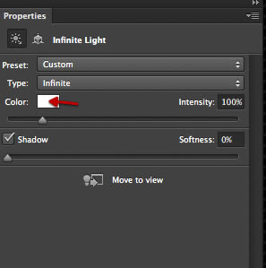 This time select a medium light blue as shown here. 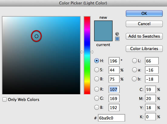 An also modify the properties as indicated below. 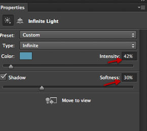 And while we are on light number 4 let’s adjust the coordinates for it as shown here, this puts it about opposite of light number 1 filling the shadows. 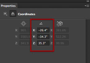 Now we need to adjust the position on light number 3 also so select it in the 3D panel. 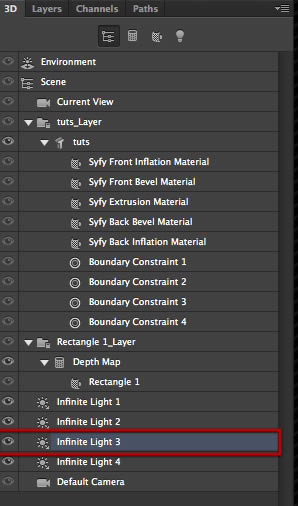 And adjust the rotation as shown here. 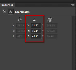 OK the overall setup its as follows, here we have light number one that comes from top right at a low angle giving us our main long shadow extending to the bottom left. 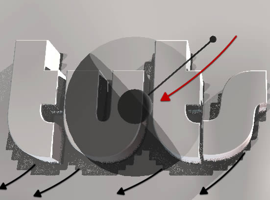 Then we have light number two which reduces the shadow strength of light number 1 and comes from a high angle slightly to the top right to give us a soft ambient occlusion kind of shadow at the text base. 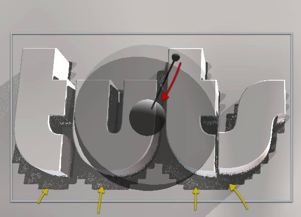 We then have light number 3 that provides a fill light with some pink warm hue, very very soft. 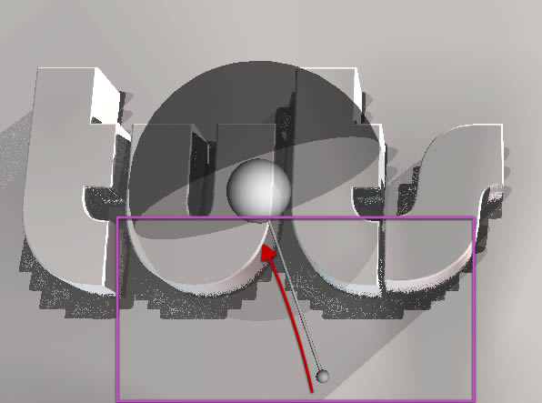 Finally we have light number 4 which in contrast gives us a slightly blue cold fill coming from the main shadow side. And that is it we have the scene correctly illuminated ready for the next step. 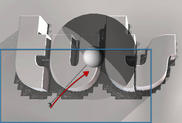 Step 5 Softer caps (edges) Now let’s modify the text a bit to get those softer corners and edges the syfy text has. Select the text as shown here. 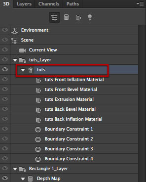 On the properties tab, click on the small Cap icon on top and adjust the settings as shown. Then click on the contour thumbnail shown here in a big red circle. 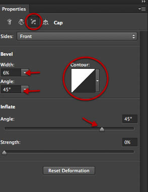 From the pop up select the round option shown here. 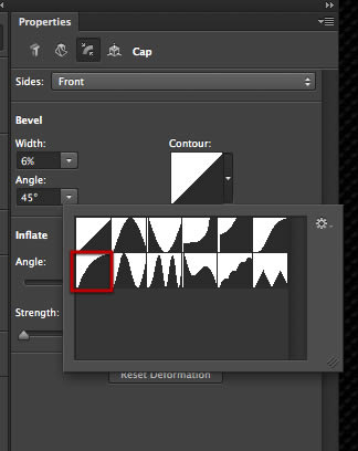 You can immediately see those softer edges. 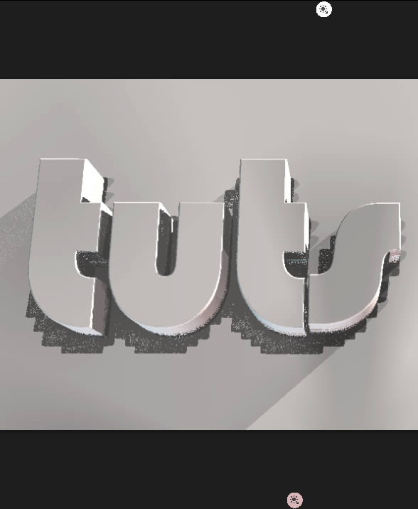 With a quick render we make sure the detail is not too much. We have adjusted the cap for the text.  Step 6 Animation OK we are ready to animate the scene, first of all click on the time line tab to open it and if you already had it open just click on the button in the middle to create a time line. 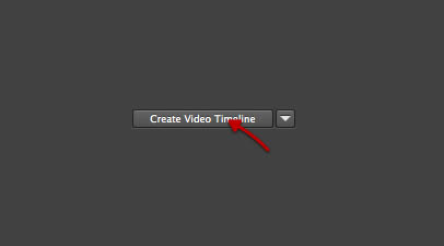 You will immediately get this, with a long tut scene, and an audio track. Click on the small arrow at the left. 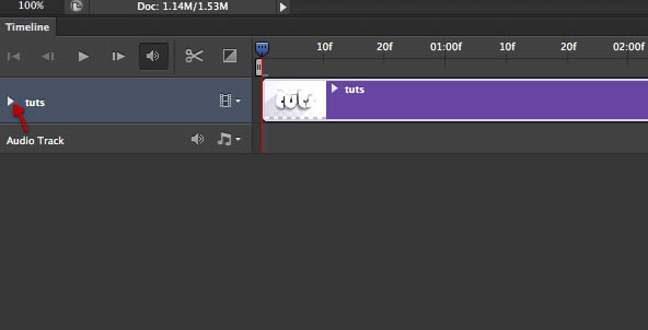 This will reveal all that its inside the 3D scene and can be animated. First of all we will select camera position. 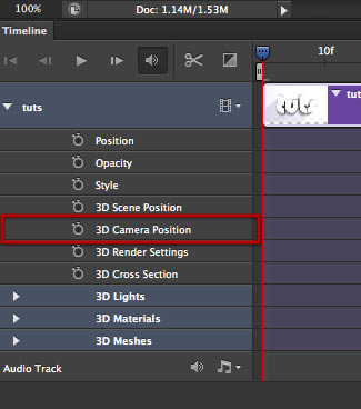 Now by default we get the time line extended all the way to fill the space, we will grab this handle shown here. 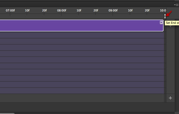 And drag it all the way to the left at about the 20f marker. 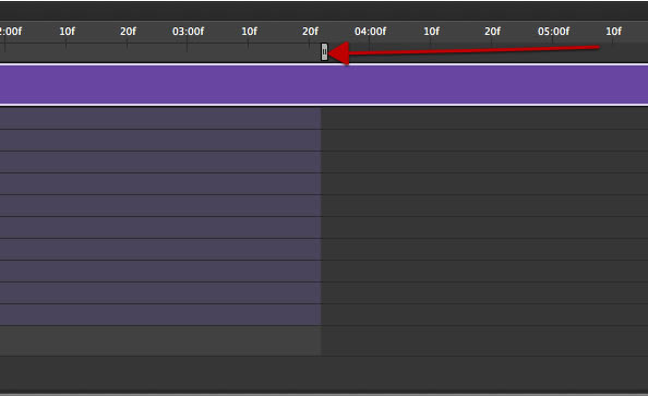 OK since we actually have our camera position at what would be the end of our animation, just click on the little stopwatch icon. You can see you get immediately a small diamond shaped key-frame on the time line 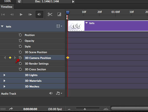 Yet since that is the way we want it to end, just drag the new key-frame all the way to the last frame. 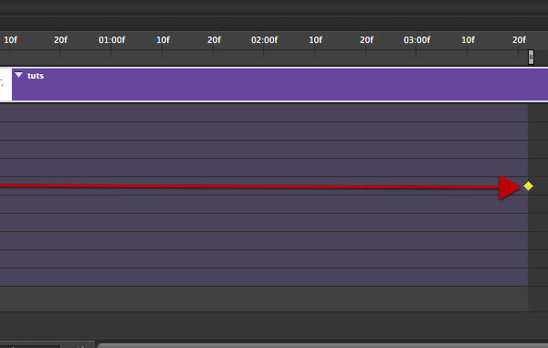 Now to move the camera around you have 2 options, first you have this familiar 3D coordinates arrows for the x y and z axis on the bottom left of your scene view. You just click and hold on that to move the view around. 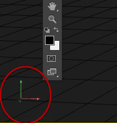 Or you can go to what we have been using so far, on the properties tab, the coordinates, where you can more accurately move the objects and view. 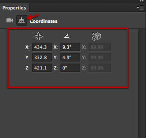 Also on the top information bar you get some controls as soon as you select the move tool.  The move tool its a generic select and move, so if you click on the area that contains an object, that will be immediately selected and control arrows will appear, yet we don’t want to move any of the objects we want to move our view. So use any of the available choices and get your camera up close in a view such as this. 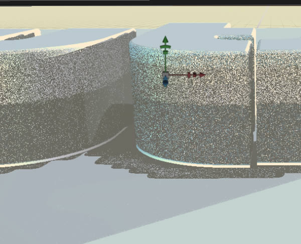 As soon as you get the desired view, click on the stopwatch icon again to create the first key frame. 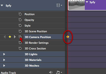 Then simply click on the play button to preview your animation, you can adjust the end and start key frames until you are satisfied with the result, just make sure that the scrolling time line indicator its on top the desired key frame so you adjust the existing ones and not creating a new one. 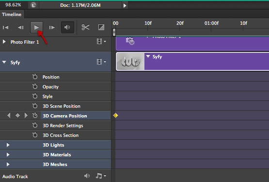 Once you clicked play you can use this scrolling time line to check every frame of your animation. And position it over the end and start key frames, plus also select points for other animation Key frames that you can create on any of the objects or layers. 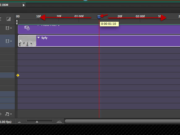 Step 7 Adding some adjustment layers and animating them We will now combine the animation of our 3D scene with some usual adjustment layers that we will also animate. First off let’s create a photo filter layer. 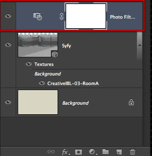 Make it a warming filter and adjust it as seen here. 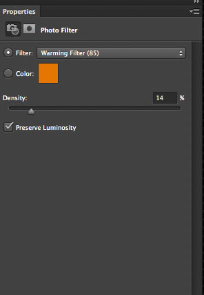 You will get a new layer in the animation that contains the photo filter and we will go ahead and create a new key frame for the opacity at about the 02:00f marker just a bit past it as shown here. 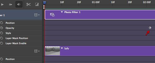 On this key frame we will set the opacity to 0. 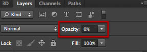 Then go to the end of the animation and create another key frame. 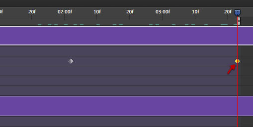 Adjust the opacity of this last key frame to 30% 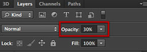 Perfect! now let’s create a new adjustment layer on top; another photo filter as shown here. 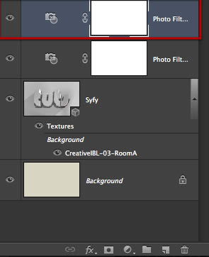 This time a cooling filter at about 25% density. 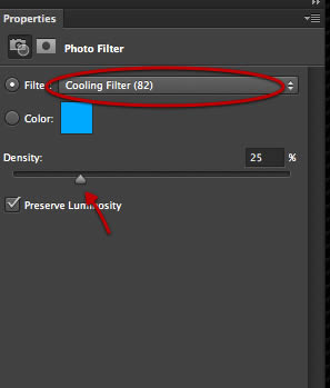 This time go to the beginning of the animation and create an opacity key frame as shown here. 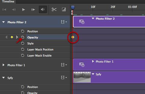 For this key frame make sure the opacity its at 100%  Now scroll down to about the 03:00f marker and create a second key frame. 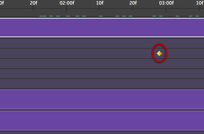 Reduce the opacity here to 0 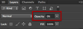 Finally create a levels layer on top as shown. 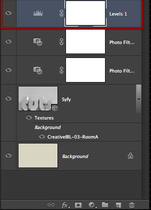 Adjust the levels as shown here. 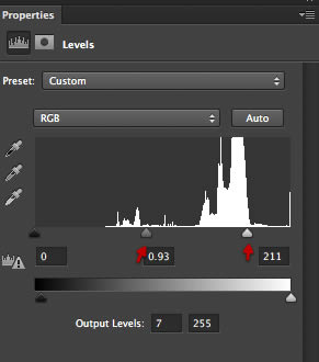 And again go to the opacity and create a key frame at the beginning. 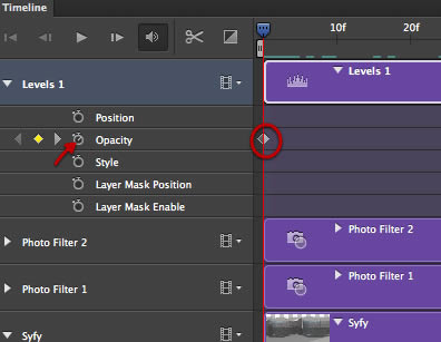 Make sure the opacity its at 100 for this key. 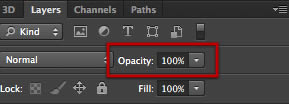 And set a second key frame as shown here. 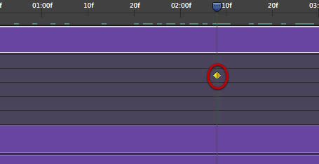 And set this second key at 0% 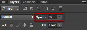 OK we are almost there, now create an empty layer on top. 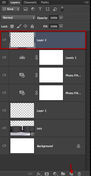 Select the color fill tool and fill this layer with 100% black  Now go to the filter menu and select render lens flare. 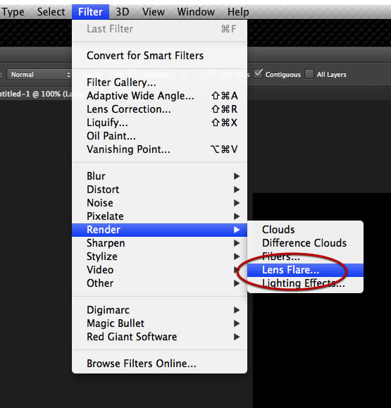 On the dialog adjust the lens-flare as shown here. 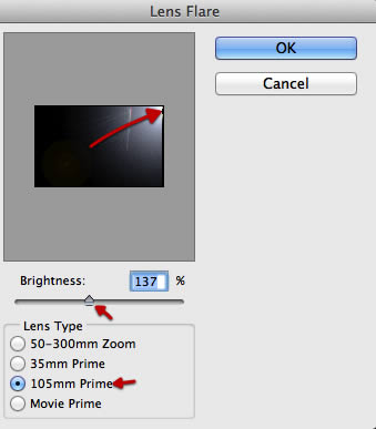 Set the layer mode to screen. 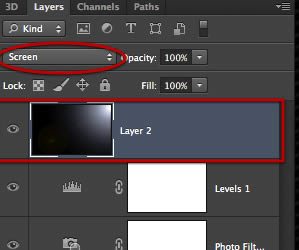 Great now back to the time line, create a new key frame a bit past the 01:00f marker  Then go to the 02:00f marker and create 5 more markers as shown here, don’t worry there is no need to be exactly on the same position, just roughly match it. 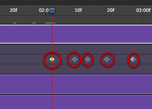 Keep these two key frames in the circle to 100% and scroll to the next key. 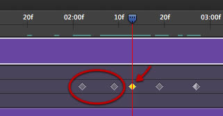 Set this one to about 23% opacity. 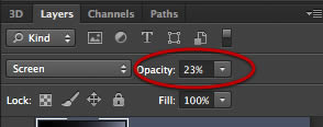 Scroll to the next key frame. 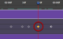 And set this one to 73% 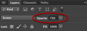 And go to the next key frame 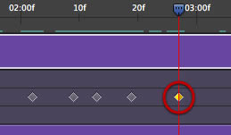 And set the opacity to 0. And that is it we have all of our new layers animated and ready to go, click on the play button to check out the preview of our work, and once you are happy with everything go to the last step. 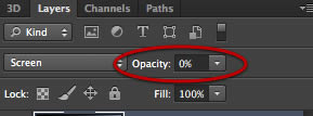 Step 8 Render and Add Audio OK simple step, yet we have to take care of some things to get a good render. Click on that tiny icon indicated here. 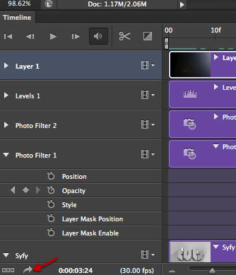 You will get this dialog box with several options, so let’s go from the top left. First name your video, and select a destination folder for it. Then adjust the encoder settings as indicated below. Then set the range of the render to be limited to the work area, and finally choose the render quality. I have made a few test renders at a lower quality which takes a few minutes to preview the work and the settings, yet once you go on final quality it will take quite a bit to render, yet the results are very good. It depends much on your computer power, yet in general it will take quite a bit, and that is why we keep the size of our document moderated. 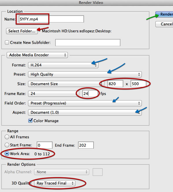 OK now on a final extra note I will show you how to import audio to your animation. 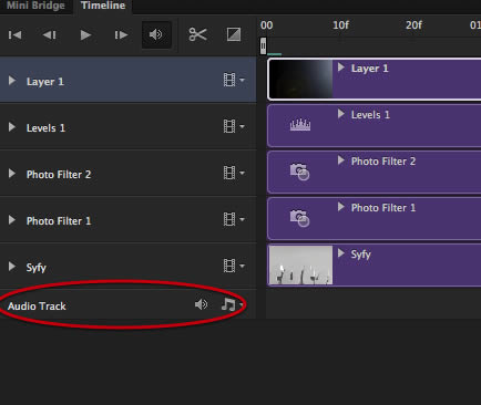 Go all the way to the right of the time line and click on the plus sign. 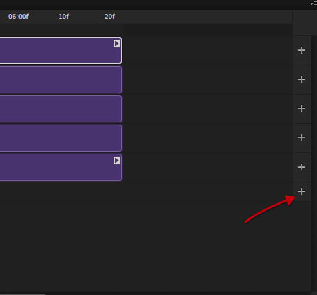 Select the audio file you want and click on open. 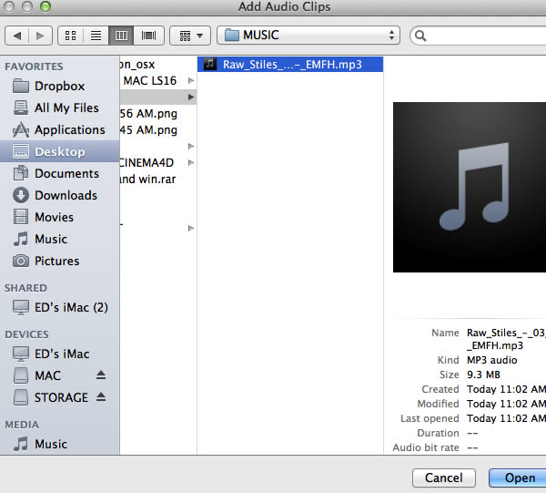 The audio file will probably extend way past the length of your animation and even further. 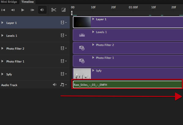 You can select the audio bar and drag it right or left so that the section you want sits in the work area where your animation is. 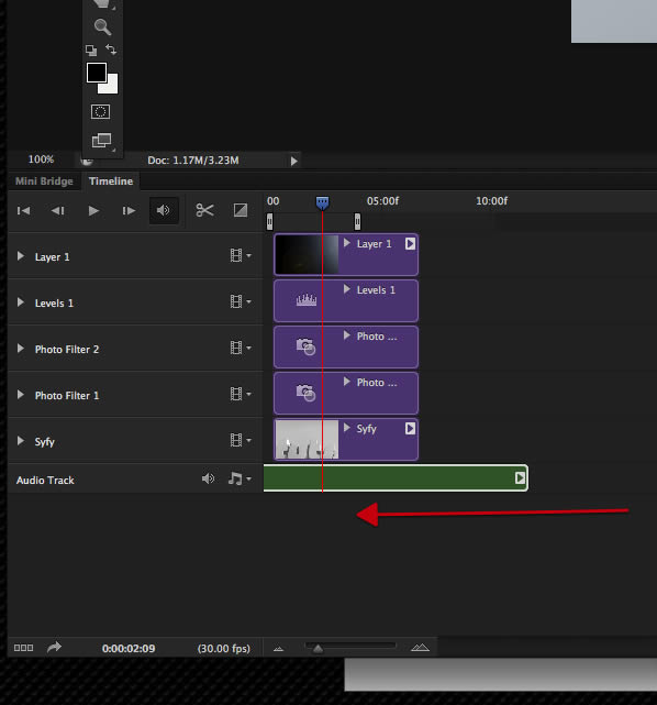 I have choose a section near the end of my audio file 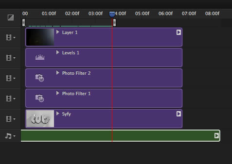 Scroll to the end of our work area and click on the scissors. 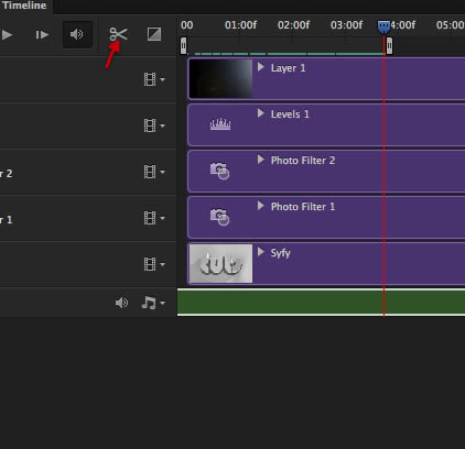 This will give you a cut on the audio track 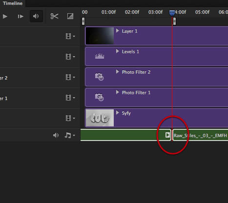 You can now just delete what you don’t need. 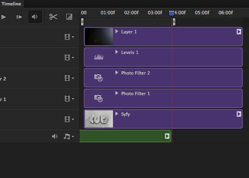 And then right click on the audio track to get the fade in fade our controls, where it depends greatly on which audio are you using, but that is about as much control you get on the audio in Photoshop. I preferred to leave the audio section last because the 3D render already taxes the computer enough, so the audio its optional or can be added to the final render after its finished. 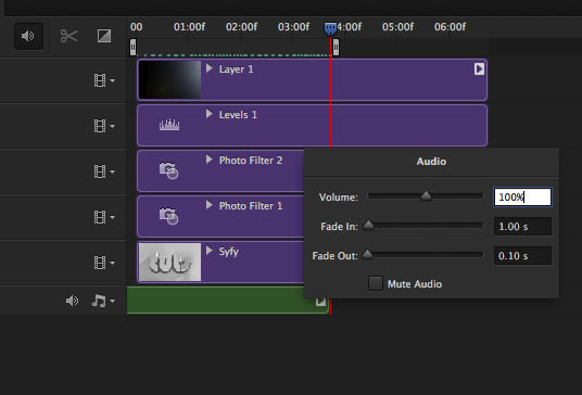 Final Animation That is it we have come to the end of these basic tut on the 3D and animation capabilities of CS6, of course for serious animation and key frame control you are better off on after effects or nuke, but for nice quick simple stuff its quite nice to be able to make it all inside Photoshop, and for me I think Photoshop could well go into this and become more powerful than nuke in the future. Сообщить о проблемном уроке Источник: http://psd.tutsplus.com/tutorials/3d/syfy-inspired-logo-animation/ | |
| Просмотров: 2695 | |
| Всего комментариев: 0 | |